Redos stavebné
centrum
Staviť na naše služby sa oplatí
Výstavba vizuálnej identity a budovanie správnych komunikačných kanálov sú rovnako dôležité ako stavba domu. Dizajnovú vizitku firmy Redos sme navrhli tak, aby odrážala jej dlhoročné skúsenosti a komplexný prístup.
Len vďaka pevným základom, ako sú reprezentatívne logo či kvalitná webstránka, sa vám imidž nezosype ako domček z kariet.
Čo sme robili
ROK
2018
Služby
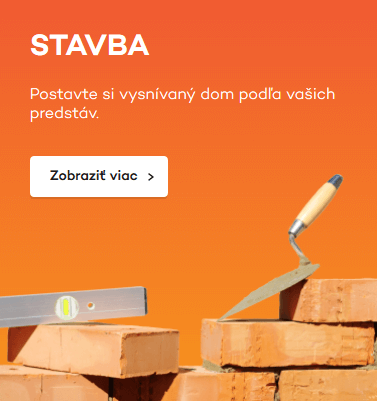
Tvorba názvu, Firemná identita, Responzívna webstránka, Kreatíva, Správa kampaní, Copywriting
DRUH
Branding, Tvorba webu, Grafický dizajn, Online marketing, Obsah

Ideamaking
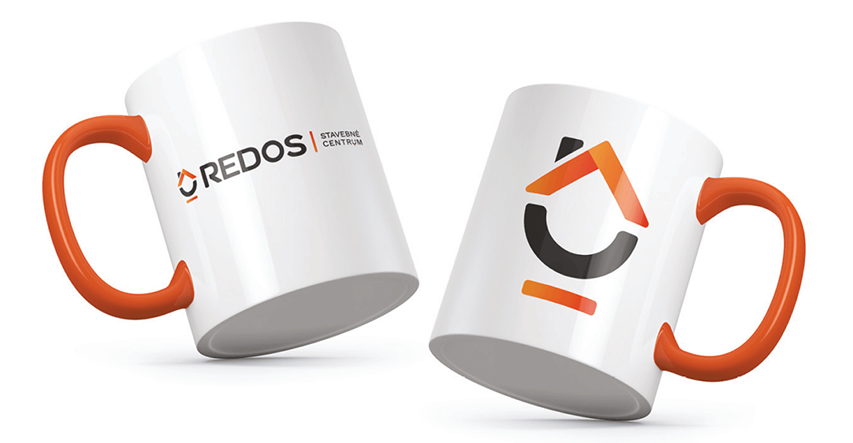
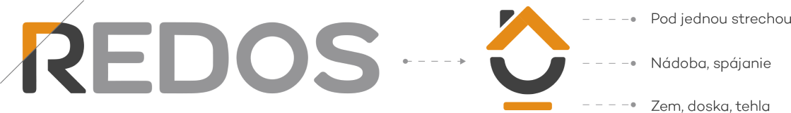
Vizuál loga vychádza zo siluety písmena R, v ktorom sú obsiahnuté základné geometrické elementy zastupujúce jednotlivé časti stavby alebo činnosti spojené s výstavbou domu – doslova od pozemku či základovej dosky až po strechu a komín.

Web Design
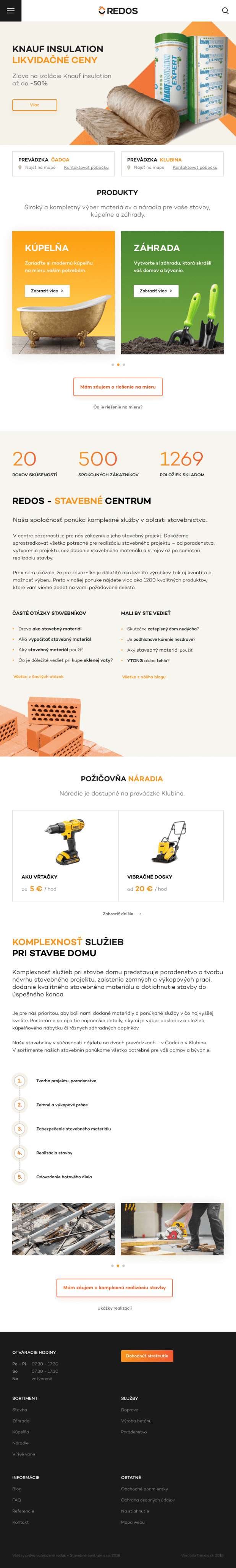
Príjemne farebná, funkčná a používateľsky prístupná ako dobre premyslená stavba – to boli základné kamene, ktoré nasmerovali tvorbu webstránky firmy Redos.
Navštívte stránku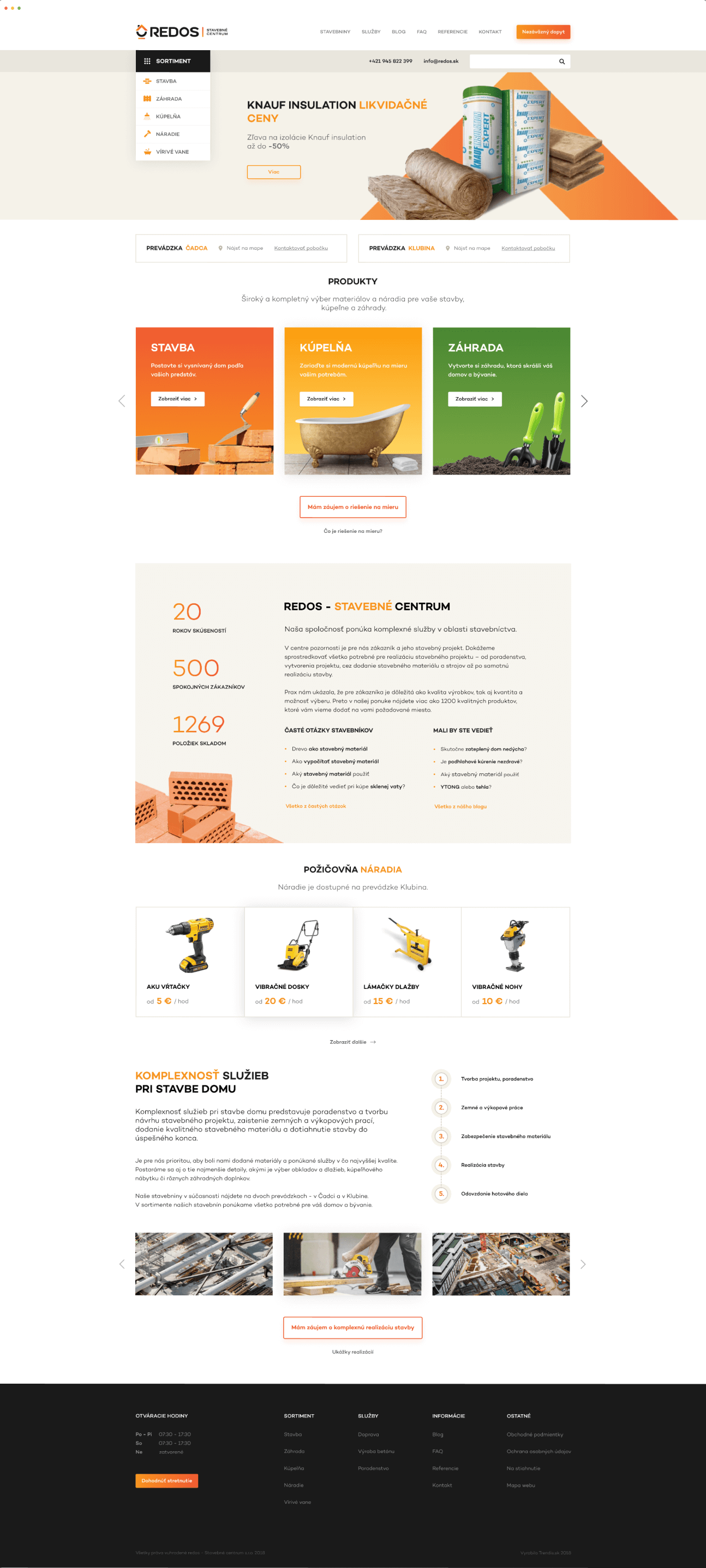
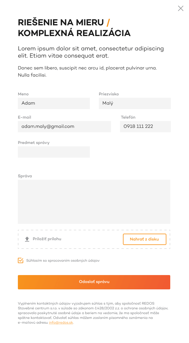
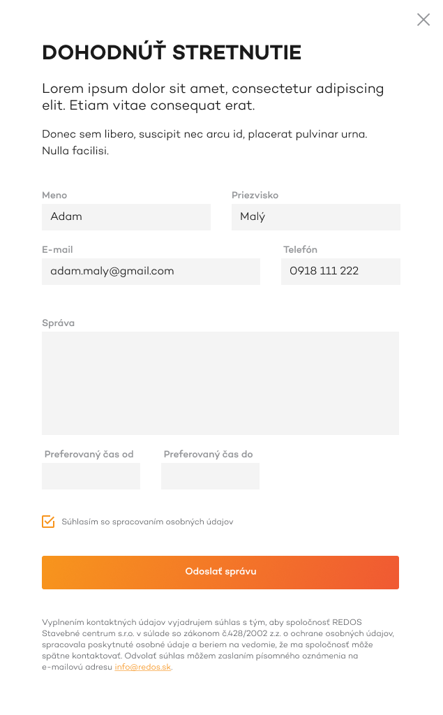
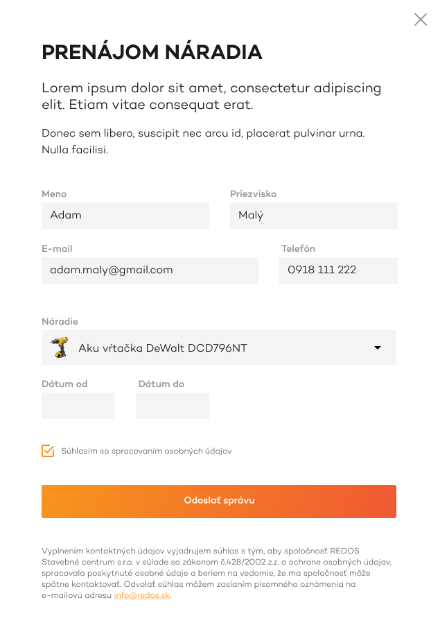
Popup okná

Responzíva