Solík zváracia
technika
Zvárali sme pekne zahorúca
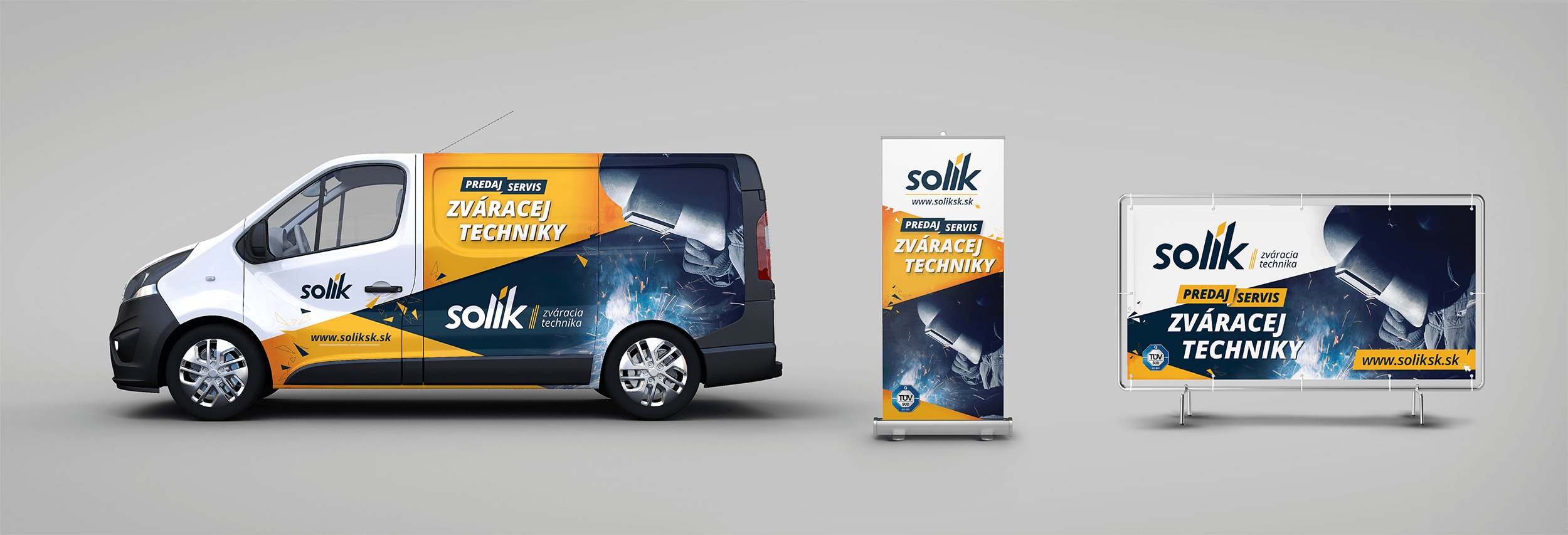
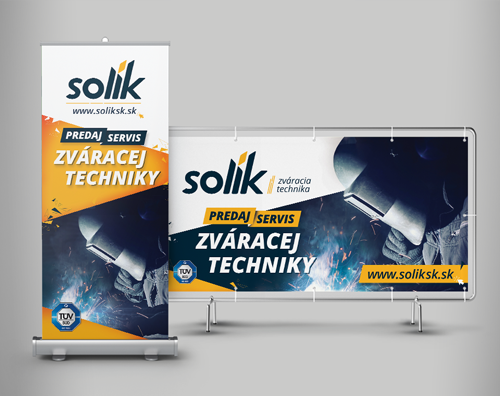
Naším cieľom bolo vytvoriť vizuálnu identitu, ktorá zaujme už na prvý pohľad. Dodávateľ zváracej techniky sa tak prezentuje moderným a sviežim dizajnom. Vidieť to nielen na novom logu a webstránke, ale aj na reklamných polepoch.
Nemyslíte si, že aj v prípade takejto komodity môže mať vizuálna komunikácia iskru?
Čo sme robili
ROK
2017
Služby
Firemná identita, Kreatíva
DRUH
Branding, Grafický dizajn
Ideamaking
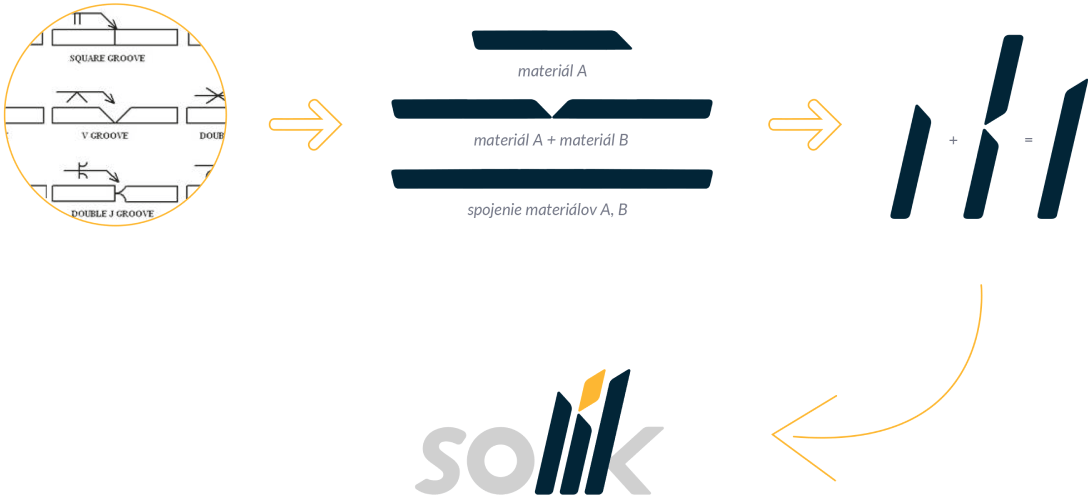
Podstata myšlienky logotypu vychádza z technického zákresu zvarov, viď skica 1 Tu sme využili potenciál troch za sebou idúcich písmen z názvu solík a to "lik", kde písmeno "l" predstavuje materiál A. Písmeno "i" predstavuje stav, kedy je k materiálu A pridávaný materiál B (vo forme dĺžňa) a písmeno "k" predstavuje spojený prvok zvarom.
Realizácie
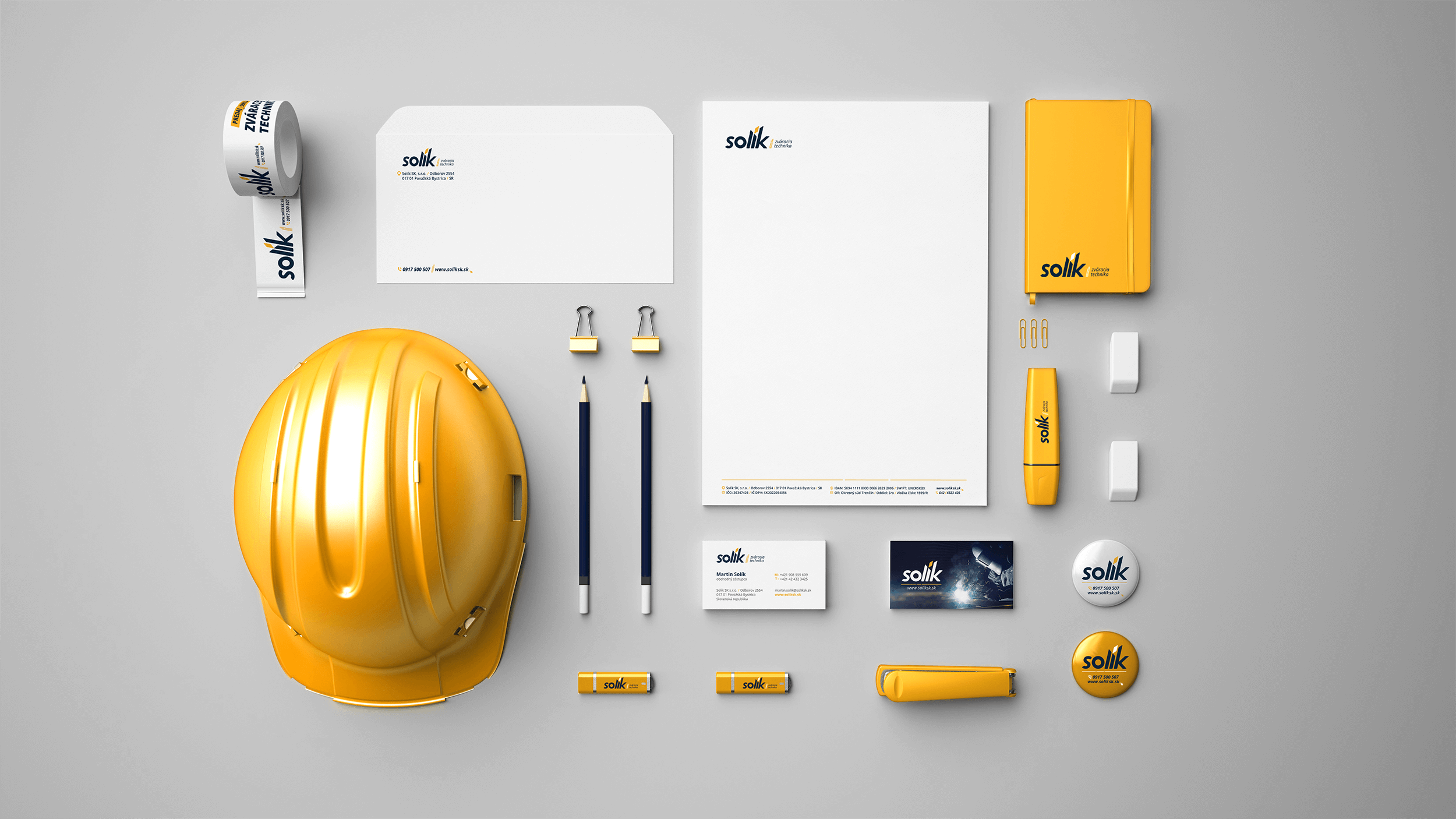
Pre klienta sme navrhli dizajn celej škály firemných reklamných predmetov, počnúc hlavičkovým papierom a obálkami, končiac písacími potrebami.